
turning
recycling
into child’s play

Challenge
Recycling rules are more complex than they seem, with common household items like soft plastics, paint cans, and coffee cups often wrongly tossed in the bin. VISY needed a way to educate communities in a clear and engaging way.
Solution
I created a campaign that gave the humble recycling bin a personality—literally a smile—while developing an interactive online game that taught both kids and adults the DOs and DON’Ts of recycling. The playful, accessible design made learning simple and fun.
Rolled out to councils across Australia, the campaign was a huge success and was later expanded with themed Christmas and Easter editions.


Challenge
Traditional membership drives can feel generic, lacking the emotional connection that turns casual fans into loyal supporters.
GROUNDED
IN EMOTION.
Solution
A personalised digital experience where users could choose their team colours, instantly transforming the platform into their own customised team environment. This design tapped into pride, loyalty, and identity, creating a stronger sense of belonging.
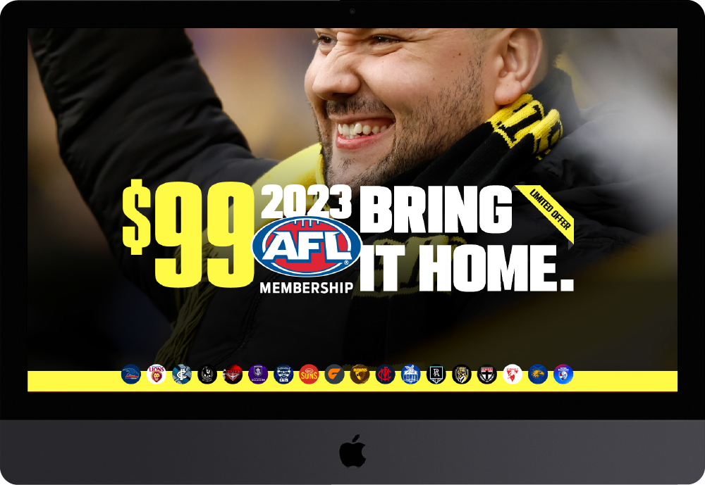
The membership process became engaging, memorable, and shareable, helping deepen fan connection and drive sign-ups.

a Mega Roll-Out
Challenge
For the launch of Keno MegaMillions, thousands of oversized, branded displays needed to land in venues across Australia on the same day. Coordinating such a wide-scale rollout posed both logistical and creative challenges—requiring precision, consistency, and strict budget control.
Solution
A modular display kit that balanced brand impact with practicality. The displays were lightweight for easy transport, strong enough for repeated use, and simple for in-venue staff to assemble without specialist tools. Careful consideration went into every element—from material selection to flat-pack packaging—to ensure the displays could travel efficiently and still deliver maximum presence.
A seamless rollout with ‘Larger than Life’ displays unveiled simultaneously, balancing impact, scale, and efficiency.


Simplified. Purposeful.
Proud.
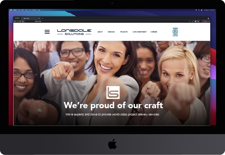
A cleaner, modern identity that carries purpose at its heart. With the B Corp logo front and centre, LS proudly showcases its commitment to doing business for good.

